Monoliths
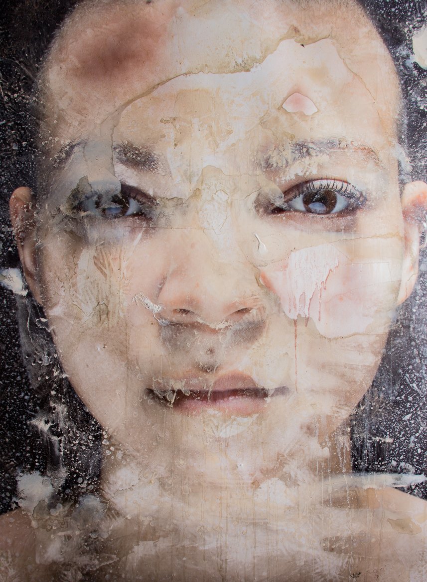
Monoliths is a virtual portal that allows users to discover and explore Black artists from various genres, that they would otherwise have no access to; providing space for these artists to thrive.
Problems
Black artists have for some time lacked visibility. Monoliths aim to aide users who seek to be educated and or acquire work made my those artists. Monoliths solves the users problem as it pertains to visibility by making the process of acquiring new work easier for the user.
Goals
Create an interesting user experience that allows the user to navigate seamlessly through artists they are unfamiliar with in hopes of finding something they’ll love.
Understanding the User
Concerning research for development many avenues were explored including: user interviews, competitive audits, audit reports. etc. I initially focused on the users ability to search for artists from various genres of the Black experience. After conducting multiple rounds of research I realized the users interest in also being able to purchase the work of these artists.
Accessibility
Users find it hard to locate Black art without assistance.Visibility
Traditionally Black artists have a harder time gaining notoriety for their work than other artists.Convenience
Monoliths takes away the frustration of purchasing through a gallery.
Pain Points
Personas
(Target Audience)

User Journey
Mapping Erica Browns’ journey revealed how helpful it would be for users to have access to a dedicated Monolith app.

Paper Wireframes
Taking time to draft iterations of each screen of the app on paper ensured that the elements that made it to digital wireframes would be well suited to address user pain points.

Digital Wireframes
As the initial design phase continued, I made sure to base screen designs on feedback and findings from the user research. Easy navigation was a key user need to address in the design in addition to equipping the app to work with assistive technologies.
Usability Study
I conducted two rounds of usability studies. Findings from the first study helped guide the designs from wireframes to mockups. The second study used a high-fidelity prototype and revealed what aspects of the mockups needed refining.
Round One Findings
People want to navigate easily.
People want to check out quickly.
Want to become familiar with artists they’ve never heard of.
Want to buy art without dealing directly with galleries
Round Two Findings
Familiarity accomplished by altering navigation.
People want access to artist’s history.
High Fidelity Prototype
Early designs allow users to access the artists section from the main page of the Monolith website. Usability study concludes that the “Emerging Artist” section was easier to navigate on all three size screens in this responsive design.
Accessibility Considerations
Provide access to users who are visually impaired though adding alt text to images for screen readers
Exceeding the minimum color contrast standard.
Ensure adequate space for controls.
Use clear language

Takeaways & Next Steps
Collectors can enjoy their art without having to experience the typical gallery issues.
User research as well as testing was critical to ensure no bias during the design phase.
Collect and analyze user feedback to continue iterating the responsive website.
Continue user testing to see how people actually use the app and identify any issues or pain points.


