Entrepid™
a digital collaborative platform, ENTREPID™ facilitates engagement and action among stakeholders at all levels, across sectors, that allows non profits to connect with each other and share resources.
Year
2024
Duration
6 Months
Project Type
Product/UI-UX Design
Role
Junior Product Designer
Overview
Entrepid (Onboarding/Admin View/UI Refresh)
Given the task of updating the onboarding process from the administrator’s perspective and updating the UI, our team aimed to increase efficiency, streamline the UI, as well as plan for adaptability and scale.
Problems
Non profit organizations associated with Entrepid currently take up to three days to fully get integrated into the Entrepid platform due to financial and inventory verification.
Extended time for internal team members to completely onboard an organization.
System processing time due to large file assets
Goals
Improve Efficiency
Initially Entrepid™ had an average projected onboarding time of three days. Stakeholders wanted the process made more efficient.
Streamline UI
Stakeholders wanted to also improve Entrepid’s™ UI globally, starting with the administrative view and modernizing the aesthetic.
Planned for Adaptability & Scale
To ensure the Entrepid platform could be easily integrated with a partner organization (this includes co-branding, singular branding).
Lack of content hierarchy throughout the product & repetitive information.
Overall User Experience felt disjointed & certain similar features did not speak well to each other.
Empathizing through Research
Concerning research for development many avenues were explored including: conducting an internal audit of admin users, competitive audits, etc. We initially focused on the users ability to onboard successfully and efficiently.
Spoke with Entrepid admins about previous flows and potential pain points.
Studied previous UX directions and documentation created from prior ideations.
Discussed and reviewed UX direction weekly and annotated feedback to incorporate into design from users.
Generating Ideas
Initially the design process began with exploration of redefining of user flows in Figjam to allow for more efficient flows.
Reviewed older user flows and legacy system, reconsolidated/condensed multiple processes to reduce redundancy during onboarding.
After redefining the user flows the team began to visually illustrate the user flows into wireframes in Figjam.
High Fidelity Designs
After reviewing each redefined user flow we began to create the high fidelity mockups (Desktop & Mobile)for review with Stakeholders.
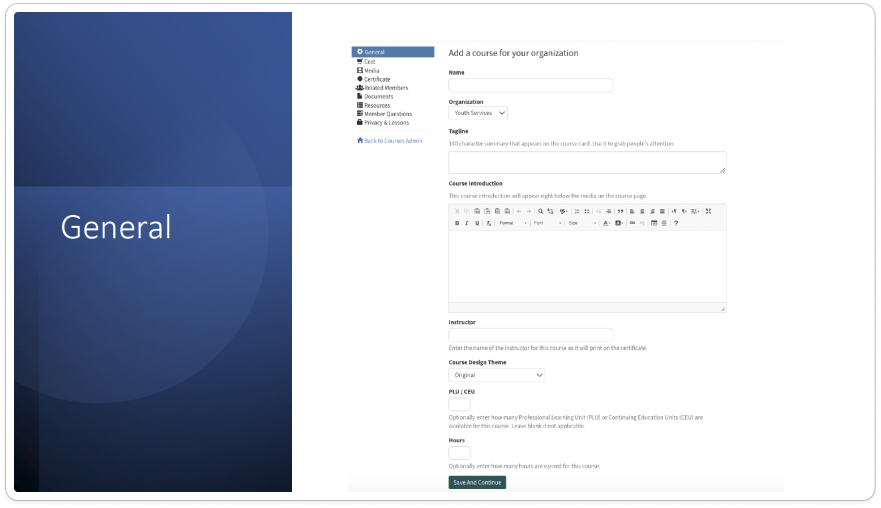
Original UI (Create A Course flow)
Updated UI (Create A Course flow)
Original UI (Create A Event flow)
Updated UI (Create A Event flow)
Prototype
Stakeholders requested a full functioning prototype to test and navigate product and provide further feedback for iteration.
Results & Takeaways
Simplified Flows
Shared Design System Components
Better Aligned Content Strategy
Reduced and or removed redundant user flows to allow for more efficiency.
Introduce more design systems elements that could be reused across the platform to reduce time needed for developers to build product.
Provided more structure and alignment for content hierarchy across product.


